Saturday, November 29, 2014

You're Invited! Christmas Show and Sale Saturday Dec 5th

It's been a pretty hectic couple of months as I was invited to take part in a Christmas show with 4 other artists - all great talents.
Rosemary Driscoll, fused glass  http://artpontiac.com/studiotour/rosemarydriscoll.html, Catherine Timm, fabric arts, http://www.catherinetimm.com/ , Natasha Walsh, acrylic painter, as well as myself, will be showing at Pam Cunningham's who is a watercolour and mosaic artist.
Copy and paste the link below for more information.
https://www.facebook.com/events/443424999129452/permalink/453428881462397/

Pam lives a short distance from the bridge crossing in Pembroke on Allumette Island, so if you are looking from some fabulous Xmas gifts or just to treat yourself, please drop by on Sat Dec 5th between 10 am and 4 pm. This is the first time that I have participated in studio show so I am really looking forward to it. Did I mention that there will be live music, treats and door prizes?

Apart from my one of a kind pieces pictured below I will have some of my cups and trays decorated with black sand from the Ottawa River as well as other pieces for the kitchen or for the soul.
Cups decorated with black sand from the Ottawa River beaches.
Handbuilt Vase - untitled.

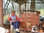
On the Farm #2 -  fired in my wood fired kiln in The Newfoundout.
Now it is down to the wire - I am opening the gas kiln tomorrow and so will not have time to make more before next Saturday - so here's keeping my fingers crossed for some great pieces for the show and hope to see you there!
Driving Directions from Ontario to Pam Cunningham's:
From the Ontario/ Quebec turnoff travel on HWY 148 for
10kms. You will pass St. Joseph’s and turn left on to Range 5.
Travel 2 kms and turn right onto Lapierre. Drive 1.5kms to 49
Lapierre on your left.

Saturday, August 16, 2014

Kicking It Up a Notch!

At our Guild a firing fee for a pot includes bisque, glaze and as many refires as you want. So if I'm unhappy with the results of a firing, I usually try reglazing or refiring- often in electric after a gas firing. Recently I had several pots that just lacked something - were just too boring. What I do with those is that I use an underglaze black pen to kick it up a notch. I find that a fired glazed surface makes using the pen much easier as it does not catch the way it often does on a bisque surface, allowing rapid, flowing marks.
The wall plate below ended up a pretty washed-out shino with some weak carbon trapping in the middle after a cone 10 gas firing. I thought that I would try a design to tie in the carbon trapping pattern and the circle on the upper left using my underglaze pen.


Shino platter cone 10 redux - pretty bland before.
Shino platter after underglaze pen decoration and a refire in electric at cone 6. 
I also took a page from  Nick Joerling and used some blue highlight dots.. 
The refire unfortunately removed the carbon trapping which was pretty weak 
but it warmed up the shino nicely to a more orange colour. 
After cone 10 gas firing - figures do not pop out as much as I would like,
 .
After refire in cone 6 electric and with underglaze pen
outlines, the figures stand out much better.
I feel that this underglaze surface decoration on a glazed surface would probably not be very good on functional surfaces such as inside of bowls and cups. Maybe not even on the outside of pots that would be often used in the dishwasher as I'm not sure how duraable the underglaze pigment is, especially on top of a cone 10 glaze refired at cone 6.. But on non-functional surfaces it can help a pot to kick it up a notch!

Sunday, June 8, 2014

To Decorate or not to Decorate that is the Question - Or in Search of the Simple Pot

Well during this last mentorship with Dan Hill I have been struggling with my platters- I really do love the undecorated, simple pot - but somehow when I try to do that it just does not work for me. I have tried to make the "frames" for my platters without so many curves to simplify - make them look more industrial. So then the interior of the platters I find needs something. However as I look at all the platters below I see that I may not have decorated some of them in the middle but because of the frames they are hardly plain simple pots - they again have a lot of stuff going on. To make a plain simple pot is much harder than I thought - and I'm still searching!
Platter with curvy, complicated rim, inside colour grading from
dark blue green to lighter green in the middle. However that rim says to me it needs
something inside to relate to the frame design. For me the plain interior does not
match the rim
Shino glazed platter with Kanthal wire additions. Some carbon trapping in the middle. Again not quite sure what to make of plain interior. I do like the circle with the Kanthal wire - will try to do more to get a more industrial look and maybe tie into some of my nuclear theme. However it is too bland and so will add some black underglaze pen design in the middle and refire. 

Shino glazed platter with blue underglazes and reglazed in electric with white glaze. With this one I feel the frame ties into the interior decoration - the "rock" on the left part of the frame works well with the forest.

Way, way too much going on - shino frame clashes with the slip and white glaze interior. I think it would have been better if it was all the same colour - either all shino or all white. 


Torso Pots

With my clay applique vases I use a lot of people imagery. So to get a more free-form abstract design I decided to use again printed slip designs from paper for the people imagery. However I found that the figures did not stand out enough - so had to scraffito in the outlines - sort of defeating the purpose of those abstract slips.

I did like the the shape of the vase - went well with the figures and the hands and then added the Kanthal wire for the hands. I was worried that with clay hands they would bread off if bumped.- plus I like gimiky things.

Again the slips did not work out well after glazing. I used a black Bringle slip for the background, topped with blue slip for the dresses, and a rutile slip for the hands and feet and face as well as a bit of red underglaze for the scarves and belts. With a white glaze on top the colours ended up a mostly greyish brown - very dull. I reglazed with a white glaze and black Albany glaze in gas again and the colours were a bit better, but still rather sombre - not what I was looking for.

Front of printed slip vase with underglaze
and scraffito


Back of vase

So to go more abstract I decided to get the pot to become the actual torso -  just the torso. I did put on some slips and wire accents. I used a patchwork design with the slips, stitched together with scraffito lines in black underglaze. This time I used some old cone 6 brown stoneware but had to reglaze as results were not great. After reglazing with Stoney White, Juicy Fruit and Licorice in cone 6 electric the results were better, but the original design of a patchwork dress were lost. - I was sort of looking for the Cinderella effect - patchworks dress on an elegant torso.

Garden Ladies - electric on right with slips and gas on left but reglazed in electric.


On another vase I decided to add a head to the torso - again not that abstract! The head is actually a planter and the whole vase could be used for a small succulent planter. Talk about cutesy and gimmicky! The original shino glaze ended up bland and I had made a mistake in mixing up a new batch of Dan Hill blue slip and it ended up metallic black instead of blue and so did not react the same way with the shino.
So reglazed again with the Stony White, Licorice and Juicy Fruit in electric which improved the results a bit.
I still do not have a really good idea of how to get where I want to go - really strong edgy abstract designs. Its hard to break out of my mold into something new that I am pleased with.

Sunday, March 30, 2014

Get Rid of Curves!

In looking back at my work over the last year or so I realize that many of my pieces include curves, lots of curves. In attempting to do something new - to get a more contemporary, edgy look, with more bold, abstract designs I feel I need to discard the curves. My first series of plates for the Dec mentorship ended up again pretty curved, - discarding and attempting something new is not that easy.. We tend to fall back into the familiar. So small steps.
I also decided to use slips and print them on the pots using newspaper to get a more abstract design. This way in the transfer from paper to pot you get random events such as parts skipping, the paper wrinkling - giving a more spontaneous effect than if it was painted on.
The big problem however has been the glazing. Slips in electric I am familiar with but trying the same at cone 10 just does not work. The last pieces for the mentorship ended up a disaster once they were glazed. I tried 3 different blue slips, 2 rutile lips and three white glazes - unfortunately I did not write down which ones were used on what pot.

Paper printed slips for the blue. I also used a reticulated glaze for the white applique but had to brush it on so the reticulation did not work somehow.I don't know why pouring over brushing should make a difference in terms of reticulation as the glaze had worked when poured on other projects. The base was a shino glaze around mostly the edges and then a white glaze (probably magnesia matt) was sprayed over. Again I forgot to write down which white I used on this plate. Plate also cracked - it was made once the heating was on in the house - I was used to drying stuff during the damper summer weather.
 Other plates I a tried a more squared off rim - adding clay strips in a more abstract pattern.  I'm not a graphic designer so not sure what step I need to take to go abstract - will be thinking about this a lot.
In order to get a more edgy look and get rid of the curves I decided to use strips of clay - and to reference our "farm" join them with "rivets" and showing a "repair" on the right bottom corner - just like homemade repairs on farm equipment. The slips - blue and bluegreen backgroud - were topped with a rutile slip representing jumbled stone fences from our "farm". Again - don't know which slips were used or which white glaze. Also again it cracked - again the drying was too fast as the central heating had come on. I feel this has possibilities and so should follow up with more, but it is hard for me to go completly abstract which I would love to do.

Thursday, January 23, 2014

A Rolling Stone Gathers No Moss - New Mentorship with Dan Hill

Well no sooner had I "graduated" from the Fusion mentorship than I rolled myself over into another one - with Wilno area potter Dan Hill http://www.hillpottery.com/DanHill/index.html.
Cone 6 soda fired urn by Dan Hill

Dan makes cone 6 soda fired work and he has given several great workshops for the Deep River Potters Guild. I've always admired his work. His insight and analysis of his work as demonstrated during his workshops has always been invaluable.

There are 7 of us apart from Dan who will also work along with us. Three are from Deep River, two from the Maynooth area and two from Madonna House - a lay religious community in Combermere. So a very diverse group from diverse backgrounds, experience and ages - which should make for an exciting journey.

Our first meeting was in mid November. In the morning we examined and discussed examples of our work as well as work that we admire - either pictures or actual pieces. I feel that I want to make more contemporary edgy work - I feel that many of my pieces end up being "cutsy". This has been a goal of mine ever since the mentorship with Steven Hill  5 years ago. At that time Steven felt that a more contemporary palette would help - but it is so hard for me to resist the yellow, beige and browns that I love.

We were supposed to bring an example of work that we admire or work that points in the direction that we wish to go. I had brought John Ikeda's cup that he had given me at my summer group woodfiring. I have always thought John's decoration style not only superb but very contemporary.
http://www.ikedastudios.com/www.ikedastudios.com/John_Ikeda_Contemporary_Ceramics.html

Underglaze decorated tumbler by John Ikeda

 John has a strong, forceful, abstract design - nothing cutsy about it. I can look at it for hours - each time seeing something different.

After lunch we discussed what we would hope to achieve with the mentorship - whether it is a generalization - to make better pots - better rims, feet, bowls, etc or to make pots with more movement, or with more elegance, better  design. I plan to continue with the 4 themes that I had with the Fusion mentorship - the nuclear theme, the forest theme, the Bottom Billion, and the dancing girls/women series. With inspiration and guidance from Dan and a mental image of John Ikeda's tumbler I hope to give my designs a more contemporary edge.